|
The Curtis Corner
|

Ptolemaic Phalangite Project:
Phase Four
Details, Details…
It was actually time for the eighth and final “underpinning” step. Now it
was time for a wash to pop out the detail. A lot of painters should be familiar by
now with the concept of the “Magic Wash”, based on Future or Kleer acrylic floor
finish. It’s often used as a last step, both to protect the figure, and to pop
out detail with ink mixed into the finish.
Using Future as a medium is also useful in an interim step, to help the ink wash flow to
the intended deep points in the detail, without pooling on top of or staining the upper
surfaces. It serves the same purpose as adding a little surfactant, like liquid
soap, to a conventional ink wash. But I like using Future for this, at this point in
the sequence and again later, and so I did it here. Jeff had done some careful ink
washes with a very dark brown wash; I suspected I could just about match that with Winsor
& Newton Peat Brown ink carried by Future and diluted with water—and I would not
need to be as neat, as the wash would do what I wanted all on its own!
Well… no. The W&N Peat Brown was nowhere near dark enough. What was I
thinking of? Must have been a W&N Brilliant Watercolours or calligrapher’s
ink shade. So I tried adding some of the carefully hoarded store of old, original
Citadel Black-Brown ink. Yep, that did it.
My technique was to mix just enough wash for one figure at a time. Using a small
white plastic tray, I’d take one brushful of W&N Peat Brown, two brushfuls of
Citadel Black-Brown, and one brushful of a mix: half Future, half distilled water.
All using the same old Grumbacher #1! Then I put that mix into the details. I
didn’t wash the figure all over: I didn’t really want any of this to darken the
green tunic color, and on the flesh, I only needed it to provide shadows in the eye
sockets, and delineate the fingers and toes. But the white armor got a thorough
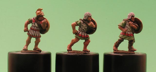
wash, which made the upper surfaces look rather messy. But detailing will take care
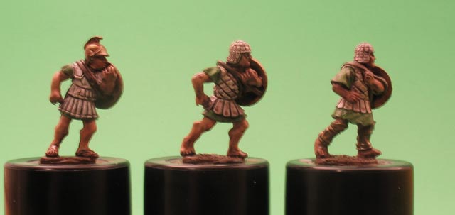
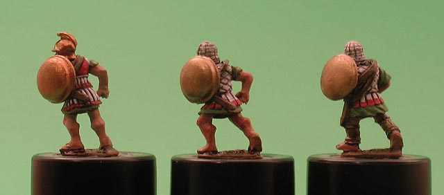
of that. Here are the two sides of each of the three figure types, once washed;
first the right side:
And now the left side:
After that, the first real detailing step was to go over the flesh again. In order
to try to match Jeff’s flesh color, I needed to add a little red to the flesh base
coat. A little VMC 947 Red did the trick.
For the second detailing step, the tunic, I thought adding a little VMC 953 Flat Yellow to
the base coat color would lighten it properly. After the first couple, I noticed
that Jeff’s highlights were a little bit, well, “chalkier”. So a
touch of VMC 820 White, along with the yellow, was necessary to make the VMC 082 Flat
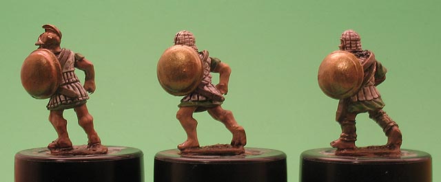
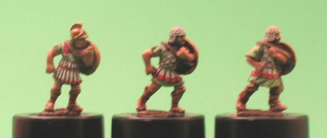
green a good highlight match. These photos show both the flesh and tunic highlights;
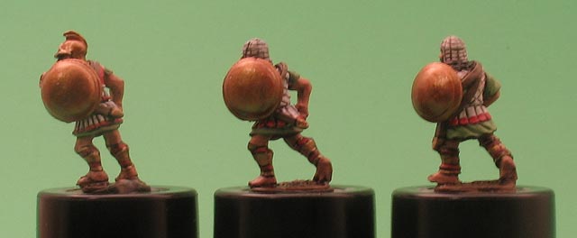
first the right side (fuzzy again!):
And again, the left side:
The third detailing step was the fabric armor. Plain VMC 820 White brightened it up:
just a thin coat over the pteruges, and a second coat to smooth them; then just a light
touch to highlight the “lozenges” of the quilted corselets and the sections of
the quilted helmets. On the “Macedonian” figures in linothorax, I just put
down a couple of thin coats of pure white over the whole body armor; much of it would be
painted over in red, in…
The fourth detailing step, being the red decoration on the armor. This was simply
VMC 947 red again, on the tips of the pteruges, and the yoke of each linothorax. On
the front of the yokes, I just “painted within the lines” to leave a white
edging; on the back, there was no sculpted yoke, but Jeff had just painted red down to the
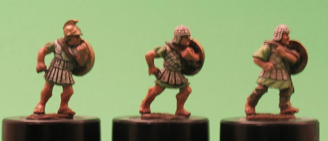
waistline, so that’s what I did, too. Here are the two views of the finished
armor; first the right sides.
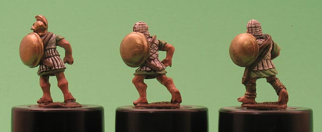
And now the left sides:
A sharp-eyed observer may note that the left-hand (“Macedonian”) figure’s
helmet and shield have become a noticeably redder hue. I wonder how that
happened! We’ll just have to wait and see.
The fifth detailing step, or series of steps, involved the greaves. On the back
rankers, that is to say the newer figures, it was less complicated: the greaves and their
straps are cast on. On the front rankers, the older figures, I would have to paint
them on as Jeff had done with his samples. I felt a panic attack coming on!
First went on a heavy coat of black to shape the greaves and set boundaries for
them. I chose Folk Art #479 Pure Black because it has dense pigment and a heavy
body. Over that came a couple of thin coats of Vallejo brass. Then—here
comes the first nervous part—VMC 950 Black to set a background for the straps, and
then Vallejo red for the straps themselves. Note to self: I’m getting too
old and shaky to do this freehand any more!.
On the back rankers, it was just a matter of first painting a coat of Vallejo brass over
the bronze undercoat: I didn’t mention it, but I skipped the last coat Brass on the
cast greaves in the “Underpinnings” phase until I had a better idea of how I was
going to get the final color to work out. But then looking carefully at Jeff’s
samples, I saw that his painted-on greaves weren’t as red as his shields and the
skull of his Macedonian helmet. So I just caught up here and did the brass, then
black and red for the straps, in between more panic attacks.
The sixth detailing step involved highlights for the straps supporting the aspis and
scabbard, and the scabbard itself. First came a coat of VMC 983 Flat Earth.
Then a line of black delineated the chape from the scabbard, and brass highlighted the
chape, as well as (as much as I could reach them) the sword grips.
The seventh detailing step left me with little to do on the shields and helmets.
Another coat of brass on the front of the Macedonian helmets, followed by black to infill
that portion was really all that was required. Finally, the magic to bring the
helmet skull and shields to match Jeff’s reddish brass: a simple wash with Winsor
& Newton orange ink! D’oh! Couldn’t have been simpler, and it
made a good match, to my eye. All that worrying for nothing.
Last bit: a few bearded faces to follow on to the one Jeff had done. I’m not
doing them all, as I like variety. If Jeff wants to do the rest, he’s more than
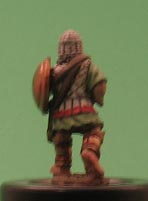
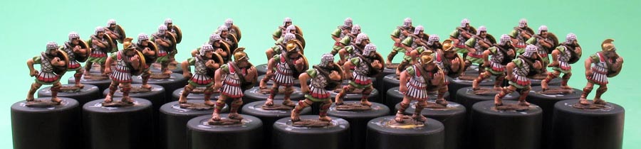
welcome to. Here are the usual fuzzy group shots of right sides:
And left sides (better):
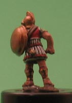
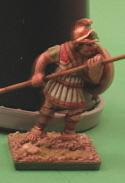
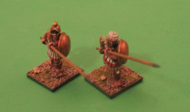
Here are close-ups of each of the three figure types, with everything done that I was
going to do! Why is it this time the right sides came out in focus, and the left
sides were fuzzy?!?! Sigh…

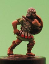


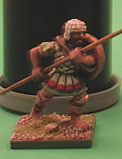
And just for comparison, here again are Jeff’s two samples of the older figures:
And that’s it! Well, a good spray coat now followed, in turn followed by a
diluted coat of Future over the metal bits to make the armor glisten again, and to provide
a gloss surface on the shield face, for Jeff to apply the transfers he’s been
making.
Now all I’d need to do was pop them off their film canisters, wrap them individually,
add in the 1st Corps pikes and spare figures which Jeff had sent, and get them in the mail
to their general!
Hopefully, Jeff will wrap up the series with some photos of the figures once they’ve
been armed, based, and are ready to fight. I enjoyed this project immensely.
It was a lot of fun figuring out how to try to get as close to Jeff’s effects as I
could. I feel that I was fairly successful, although I’m nowhere near as good a
figure painter as he is, and certainly not a real artist. Now, what’s
next? I’ve been staring at some A&A phalangites, thinking about doing much
the same project all over again; but my Maccabeans are calling…
(Jeff butts in: Thanks Allen for a nice job of following the style, they look great, and a thorough and detailed report too. I hope this helps everybody understand a bit about the process of making a 28mm ancient game regiment. I will carry the ball forward in part five, where the figures are based and given the final touches to allow them to show up as needed reinforcements in the ongoing Syrian Campaign!)